Wednesday, 26 January 2011
Heads and Joints
Head Turn & Broken Joints from Humphrey Erm on Vimeo.
Some back to basics and useful practice for the test these next three days. The point here was to animate Hogarth from The Iron Giant doing a headturn whilst being either Angry, Tired or Shy. I chose the last one. The second was to animate a rough Hogarth hammering into a table with broken joints, meaning his joints allow his arm to bend in ways it shouldn't.
Saturday, 22 January 2011
Design Week 2
Went through another week with everyone's favorite teacher Lawrence, learning more of the fundamental principles of design:
- Line
- Values
- Spacing
- Colour
- Texture
- Shape
- Volume
During this week we started of with strict values, alongside what we have learned from last time, though urged to not use line too much or at all. The theme for the assignment was Act 1 Scene 1 from Hamlet. For those not familiar with the play, its a scene where threecharacters see the ghost of the dead king. What was fun with this was that we were allowed to put it in any timeframe we wished, so I placed mine during the golden era of piracy.

The second assignment revolved around designing an Atlantean weapon using rendering to invoke volume. This meant we had to illustrate the shapes by placing gradients of gray across the surfaces. While I have done this before in life drawing, it was difficult to pull it off convincingly, and in the end the result was somewhat sloppy.

The third and final assignment was to illustrate an adult being saved by their childhood imaginary friend. Th key concept here was to demonstate depth by placement of characters and objects in order to invoke a mood, as well as texture, in order to give the feel of material in the image. After fiddling with alot of thumbnails, trying to come up with ideas, I eventually came up with the idea of a unicorn, and decided it should save his creator who is now a grown woman from a burning building. Due to the difficulty and constant changes to improve it, it isn't fully finished. The buildings aren't fully rendered, and theres a terrible tangent (see if you can find it). However, the unicorn felt very volumetric according to my teacher, which is a good sign.

These design weeks have been amazing for me, loving the secrets and tools of the trade, learning what it is thats important in an image, and feeling the motivation to experiment further.
Friday, 21 January 2011
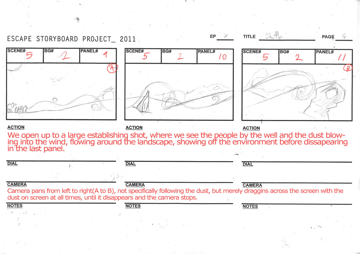
Storyboard Week
A little late update from last week, when we made storyboards for our Escape project. These are the five pages that me and my partner Camilla did together to tell our story, but its only fair to give the background and premise since the whole story isn't told in our storyboard.
We had this idea of an animated TV series about a kid who would travel through parallel dimensions through the use of a portable device. Each episode would be a new adventure in a new place, allowing the writers to come up with anything they wish. Key concepts in the show is the theme of escape: our protagonist is afraid of responsibility and attachment, because he feels unprepared to live up to expectations peoplle have of him. This is why he flees, and escapes into other worlds, where he hopes a reset will make his life better, though the same problem arises nonetheless. Another key rule is that the device needs 24 hours to recharge itself after use, so he can't just constantly be zapping himself of anywhere immediately.
That being said, here are the pages!


 We got some notes from our teacher afterwards, detailing mistakes and improvements that could be made to it, such as improved angles, pacing and clarity. However, he was for the most part pleased with the two of us, and the rest of the class seemed to be engaged in the story.
I'll update this week's work a bit later.
We had this idea of an animated TV series about a kid who would travel through parallel dimensions through the use of a portable device. Each episode would be a new adventure in a new place, allowing the writers to come up with anything they wish. Key concepts in the show is the theme of escape: our protagonist is afraid of responsibility and attachment, because he feels unprepared to live up to expectations peoplle have of him. This is why he flees, and escapes into other worlds, where he hopes a reset will make his life better, though the same problem arises nonetheless. Another key rule is that the device needs 24 hours to recharge itself after use, so he can't just constantly be zapping himself of anywhere immediately.
That being said, here are the pages!


I'll update this week's work a bit later.
Friday, 14 January 2011
Face Phase

Well, first post of 2011. This time around its simply a profile picture for Blogger, so that the people I follow don't just see an anonymous silhouette.
I was going for a simplified look, trying to get the overall head and hair shape, with soft curves and block colours. I think it came out alright, though I'm sure it can be improved. As of writing this I believe the curves at the top right of my head in the hair should be pointed more to curve with the bottom of the hair.
Happy late New Years by the way!
Subscribe to:
Posts (Atom)